7 tips to make your website user-friendly

Digital & Technology
344 week ago — 7 min read
A website should not just exceed expectations in certain specific ways (design or content), it also needs to have an interface that enhances the website’s user experience. In other words, the website has to be useful, and suitably supplement your content while being easy to understand at first glance. Different individuals lean toward different styles, but there are certain underlying principles that should be followed when designing your website.
To quote Steve Jobs, “Design is not just what it looks like and feels like. Design is how it works.” Here are 7 principles to create a user-friendly website.
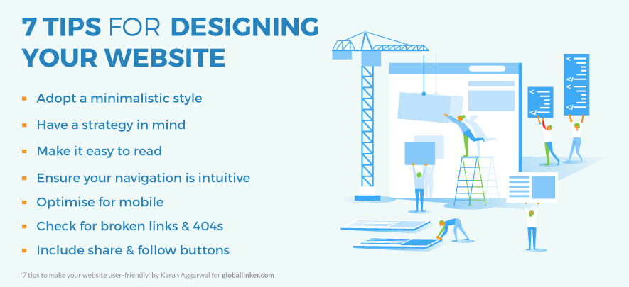
1. Clutter-free and minimalistic web pages
Too much clutter can distract readers and make a site appear overly complicated. A minimalistic design on the other hand helps a reader focus on what’s important while giving you the opportunity to build better-looking designs. Nobody reads every word on a website, it’s better to appeal to emotions rather than word count. Content and Calls To Action are crucial, obviously, yet make a point to split them up with larger subheadings and readable sections. Images or symbols are an effective way of communicating your point.
Whitespace is a fundamental design component (also called ‘negative space’). Whitespace alludes to the regions around components on a page that are unfilled and lacking content or visual elements. Although it might appear to be superfluous, it’s actually responsible for clarity and content prioritization.
2. Follow a plan
A website has only a couple of seconds to grab someone’s attention and tell them about the value proposition. To ensure that the website is viably addressing the requirements of your visitors you need to have a clear strategy for conveying your information from the first time they visit your website to the minute they turn into a client. You need to plan your site for the subsequent stage, not the final stage. It’s all about answering the right questions in the right order. Then apply colour, contrast, size and spacing for further accentuation, remaining conscious of what is drawing attention on your page and making sure that it’s always deliberate.
3. Easy to read website content
Readability is the key. Usually, people click out of a site just because they feel the site is not professional. Utilising extravagant text styles that may not be accessible on most computers is not recommended. If a font you use is not available on a visitor’s computer the web site will use the default font of their computer which makes for a bad experience. So make sure to use common and professional web fonts.
It is imperative to have an adequate contrast between your text and its background so that the text is clear. Early websites had small fonts, but, over time, people understood that 12pt fonts are hard to read online. A run of the mill general guideline you’ll see on the web is to keep your body text at least 16pt. That is a decent place to start, keeping in mind that the size completely depends on which font you’re using.
Readability on smaller screens, for example, cell phones, has played a huge role in this trend’s rising ubiquity, however, it likewise fits in pleasantly with the ever-famous minimalist and flat design trends. As a rule, don’t utilize in excess of three unique typefaces throughout a single website. A few activities may call for more intricate textual style blends, but if you do choose to use a variety of fonts, the overall effect should be harmonious, not cluttered.
4. Ensure your site is easy to navigate
There’s nothing worse than a site with a disorganised or confusing navigation interface. Complicated navigation systems create way too many options for people, so much so that they may decide to leave your site altogether. It is important to ensure that your visitors can easily find what they’re looking for, or else they have no reason to stay on your site. Instead, they will certainly bounce and find a competitor that offers a better user experience. This can allow you to build better-looking designs without compromising user experience or conversion rate optimisation.
5. Optimise for mobile
We live in a mobile society. So don’t forget about optimising your site for mobile. As much as 80% of internet users own a smartphone and usually, people are unlikely to return to a mobile site they had trouble accessing. But you won’t be happy having a customer visit a competitor’s site instead because of this reason. It’s a necessity to tailor your site to fit the needs and wants of your visitors and create a seamless mobile experience for the users.
6. Check for unknown 404s or broken links
Always check for broken links within a site before uploading it to your web server. There might be a few pages or links here and that aren’t working. And on top of all that, visitors won’t even let you know. Evaluate whether or not your site has broken pages. One may find previously high performing landing pages that are unpublished or website pages that are improperly linked.
7. Include share and follow buttons
Producing great content and offers only go so far if you aren’t giving your clients the chance to share what you have. If your website currently lacks social share buttons, you could be passing up a major opportunity for a great deal of social media traffic that is produced by individuals perusing your website. Social sharing buttons are the small buttons that are around the blog posts. They contain symbols of a various online networking site and enable you to share the page specifically on the social networking platform of your choice.
In the end, I would like to suggest that you never stop searching for inspiration! Inspiration is an important part of the creative process when it comes to web designing. Learning and getting new website composition tips, regardless of how much experience you have, is a amongst the most important things you can do to make and keep up the quality of your website.
Use the GlobalLinker Website Builder to create your company website
Create your very own e-commerce store with LINKER.store
To explore business opportunities, link with me by clicking on the 'Invite' button on my eBiz Card.
Disclaimer: The views and opinions expressed in this article are those of the author and do not necessarily reflect the views, official policy or position of GlobalLinker.

Posted by
Karan AggarwalI am looking to connect with other business professionals. I am keenly interested in digital marketing, business development, operations, strategy planning, etc. Invite me to...
Network with SMEs mentioned in this article
View Karan 's profile
Other articles written by Karan Aggarwal
Drupal vs WordPress for hosting your website
333 week ago
Most read this week
Trending


Comments (2)
Please login or Register to join the discussion